Optimize User Flows with Navi
Accessibility and usability — contrast, labels, touch targets and clarity, fixed without changing how the page looks.
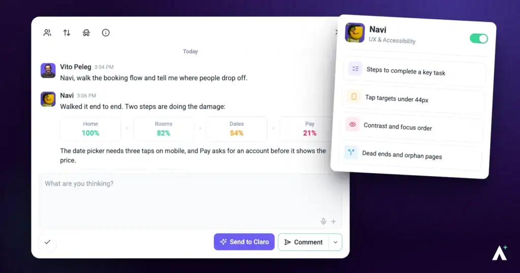
Accessibility work usually arrives as a list of failures nobody knows how to action, or as nothing at all until somebody complains. Navi does the opposite: he finds what fails, tells you who it affects, and fixes it without changing how the page looks to everyone else.
What Navi can do for you
Navi checks whether everyone can read and use a page, and names the standard where one applies. This is what you get back from him:
- Accessibility findings in a page review. One task per problem, pinned to the element: a one-line summary, then Current (what fails now), Solution (the smallest fix, for example raising inactive tab text from 40 percent to at least 60 percent opacity to pass WCAG AA contrast) and Impact (who it affects), with a priority and the device. He covers contrast, touch targets, form labels, error messages and readability.
- Answers in a task. Select Send to Claro on a task about accessibility, keyboard or focus behavior, or mobile layout and Navi replies in the thread.
- The fix itself. Where a finding or a reply proposes a change, Show me previews it on the page and Do It applies it on a WordPress site connected through the Atarim plugin. On any other site, the task says what to change, ready to hand over.
Navi Personality Snapshot
Navi is UX & Accessibility, and he thinks in routes rather than screens. His line when a check begins is Navi here, mapping the journey, and that framing runs through everything he does — where someone is trying to get to, and what’s in the way. A dead-end call to action and an unlabelled form field are the same kind of problem to him, one just happens to be measurable against a standard.
He’s the most literal member of the team, and it’s his best quality. Contrast is a number, so he reports the number. Where a standard applies he names it rather than describing the problem in his own words, which is what makes a finding survive being forwarded to a client who has never heard of him.
He’s also careful in a specific direction: he’d rather understate than overclaim. He won’t say a page is accessible because nothing obvious failed, and he won’t infer compliance from code he can’t see. When he fixes something he makes the smallest correct change and leaves the design exactly where it was — his work is meant to be invisible unless the visible part was the fault.
How it actually works
| Mode | What Navi does | Does anything change? |
|---|---|---|
| Checking | Reads the page and reports what fails. | No. A check writes nothing, ever. |
| Fixing | Makes the smallest correct change to the defect you’ve asked about. | Yes — scoped to that defect. Your own Do It applies straight away; a change you ask the AI to apply to a published, private or scheduled page waits for your approval. |
What you can check
| Target | When to use it |
|---|---|
| A single page | Before publishing, or when a specific page has been flagged. |
| More of the site | A compliance obligation, where a single accessible page doesn’t help anyone. A review checks the page you have open, so run one on each page in scope, or ask Claro in workspace chat (Beta) to look across the site. |
What Navi checks
His remit is narrower than “accessibility” in general, and it helps to know where the edges are.
| What he checks | What that catches |
|---|---|
| Colour contrast | Text that doesn’t stand out enough from what’s behind it, measured rather than judged. |
| Touch target sizing | Buttons and links too small to hit reliably on a phone. |
| Form labelling | Fields with no label, or a label that doesn’t say what the field wants. |
| Error messages | Whether someone who gets it wrong can tell what went wrong and where. |
| Readability and cognitive load | Content that asks a reader to hold more in their head than they need to. |
| Inclusive design generally | Patterns that shut people out of finishing what they came to do. |
The minimums he measures against
These are fixed standards, not preferences, which is what makes a finding quotable in a client conversation.
| Measure | The floor |
|---|---|
| Text contrast | At least 4.5 to 1, or 3 to 1 for large text. |
| Contrast on controls and focus | At least 3 to 1 for anything that isn’t text. |
| Focus indicator | Visible, and at least two pixels thick. |
| Tap targets | At least 24 by 24 pixels — and well short of the 44 a thumb actually wants. |
Why each finding is worth fixing
| Area | Who it affects |
|---|---|
| Contrast | Anyone in bright light, on an older screen, or with reduced vision — which is most people, some of the time. |
| Touch targets | Anyone on a phone, and particularly anyone with limited dexterity or a tremor. |
| Labels | Screen reader users, for whom an unlabelled field is an unanswerable question. |
| Error messages | Anyone who’s made a mistake and can’t tell what or where — the most common point of abandonment on a form. |
| Readability | Everyone, and most of all anyone reading in a second language, in a hurry, or on a small screen. |
He measures rather than estimates
Contrast is a number, not an opinion, and Navi treats it that way.
| Measurement | What you get |
|---|---|
| Contrast checking | The actual ratio for a given combination, and whether it passes at AA. |
| Accessibility report | A proper report across the whole page, which Claro can run during the overview when it’s relevant, rather than a judgement by eye. |
How a finding reads
Every finding says what’s wrong, why it matters, and what to do — not just the fault.
“The card is a link but relies on subtle styling, so keyboard users may not see focus. Add a distinct outline or elevated ring on focus, and make sure it’s visible against the dark surface.”
His fixes are invisible
This is the part worth understanding before you let him near a client site.
That constraint matters because accessibility fixes have a reputation for wrecking designs. Scoping each one to the defect is what stops an audit turning into an unplanned redesign.
Show me and Do It
Ask Navi about an element on the page and, where he proposes a fix, you get Show me and Do It beneath his answer. Show me applies the change to the page in front of you; you can toggle it off and back on to compare, regenerate it if it isn’t what you meant, and take a screenshot straight into the thread as a comment. Do It applies it for real, queuing and running in the background, and an Undo control then appears on that comment. Once it has applied, the task moves to Pending Review.

Running a check
Navi thinks in routes rather than screens, and he goes deep on accessibility when you name it as the goal.
Instructions:
- Open the page from Projects, then open the Review tab in the sidebar.
- Choose the preset that matches your goal for the page — each one carries its own set of specialists — or switch to Custom to write your own prompt and pick the specialists yourself. Find accessibility gaps and Increase conversion rate bring Navi in. A preset fills in the description and replaces anything already typed there.
- On Let’s invite your InnerCircle, check that Navi’s switch is on. The preset sets the switches, you can turn any specialist on or off, and Claro’s switch always stays on.
- Edit the description if you need to. Find accessibility gaps already asks for a WCAG 2.1 AA audit; with Custom, say that accessibility is what you’re checking, so he goes deep on it.
- Select Review This Page and leave it — it works down the page section by section in the background at the width you’re viewing it, and compares full-page screenshots at desktop, tablet and mobile widths. The findings are listed under Tasks in the Review tab, grouped by section of the page, each signed by the specialist who raised it.


What comes with each finding
| Captured | Why it matters |
|---|---|
| Screenshot | Shows the page as it was when the finding was made. |
| Element location | Identifies the exact element that fails. |
| Screen size and browser | Explains failures that only appear at certain sizes. |
| Status, priority and tags | Lets the finding move through your process like any other task. |
| The thread | Replies and decisions stay attached to the finding itself. |

The check closes with a plain summary of what was found. When Claro runs an accessibility test during the check, its report appears under AI Tool Reports on the review and can be downloaded as a PDF on paid plans — useful evidence that the work was done.
Where Navi works
| Where | What he does | How it starts |
|---|---|---|
| Page checks | Reads a page and reports what fails. Changes nothing. | Choose a preset, or pick him with Custom. |
| On the page | Answers about a specific element and applies the fix there and then. | Click the element and ask. |
| In a task | Works inside a single task — fixing, and commenting the result. | Claro routes the work to him, or you ask in the task. |
| Workspace chat (Beta) | Picks up accessibility work across all your projects and sites. | Ask Claro; it routes accessibility work to Navi. |
| On a schedule | Recurring accessibility work — a monthly pass across a site under a compliance obligation. | Set up a workflow. It creates the task and puts Navi on it when it runs. |
Working with a reply
Every AI answer carries a few controls beneath it. Alongside Show me and Do It you can copy the response, and mark it a good or bad response with the thumbs — that rating goes back to us and is how the specialists get better at the work you actually do.
The composer underneath has a Send to Claro button beside a Comment / Add a note split button. Comment posts normally. Send to Claro brings the AI in, and whichever specialist the work belongs to is the one who answers. Add a note posts internally — only Admins and Team Members can see it. To hide the whole task from guests and clients, select the internal icon at the top of the task (its tooltip reads Set internal task). Select it again to undo.
White-label behaviour
What Navi doesn’t do
| He doesn’t | Who does |
|---|---|
| Redesign anything | Aesthetics are Pixel‘s. Navi raises the contrast value; he doesn’t reconsider the palette. |
| Rewrite persuasive copy | Messaging and tone are Lexi‘s. He’ll clarify a label, not rework a headline. |
| Audit SEO | Titles, descriptions and search structure are Index‘s. |
| Test whether things work | Broken links, missing images and faulty forms are Glitch‘s. |
| Certify compliance | He checks what’s visible against WCAG AA. That is not an audit, a certification, or legal advice. |
How Navi treats your site
- The smallest correct change. A missing accessible name means the label is added. The element isn’t rebuilt, restyled or restructured.
- Visible content is preserved. He doesn’t alter what the page says while fixing how it’s exposed.
- Your live page stays up. He won’t unpublish, rename, re-address or bin a page.
- Approval before it lands. Changes needing your sign-off wait for you. A request nobody decides on within 14 days is declined automatically, and nothing runs.
Frequently asked questions
Which standard does Navi work to?
WCAG AA as the baseline — the level most accessibility obligations are written against.
Does a clean check mean my site is compliant?
No. He checks what’s visible against WCAG AA. That isn’t a formal audit, a certification, or legal advice, and keyboard and screen reader journeys still need testing by hand.
Will his fixes change how my page looks?
Not usually. He makes the smallest correct change and preserves the design, so fixes are invisible to sighted users — unless contrast or sizing is the fix, where the visible change is the point.
Does he actually measure contrast?
Yes. You get the real ratio for a combination and whether it passes at AA, rather than a judgement call.
What if the client’s brand colours fail?
It happens often. Show them the measured ratio, then bring in Pixel to find an accessible variation that still looks like their brand.
Who handles alt text, him or Index?
Both, for different reasons. Navi treats it as accessibility, Index as search and structure. Fixing it once satisfies both.
Can I check more than one page?
A review checks the page you have open. To cover more of a site, run a review on each page that matters, or ask Claro in workspace chat (Beta) to look across the site. For a compliance obligation, cover every page in scope. One accessible page doesn’t help anyone.
Do I need to understand accessibility to use it?
No. Findings explain the problem, why it matters and what to change, in plain language. Where a standard applies it’s named, so you can quote it if a client asks.
Does he check static content like footers?
Yes, where it affects flow or accessibility — links, heading order, missing labels and structure are all in scope even in a section nobody interacts with.
Does he test with a screen reader?
No. He evaluates what’s visible on the page and won’t assume compliance at code level. Real assistive-technology testing is still a manual job.
How do I turn a finding into actual work?
Use Show me to preview the change on the page, then Do It to apply it. It queues and runs in the background, and an Undo control appears on that comment afterwards if you change your mind.
Which findings should I fix first?
Work in priority order. Critical (red) and high (orange) affect conversions and clarity, so start there; medium (yellow) covers usability and hierarchy; and low (green) is cosmetic.
Common issues
- A contrast failure on the client's own brand colours — common, and awkward. Show them the measured ratio, then involve Pixel on an accessible variation of the palette.
- Failures on mobile but not desktop — touch targets and restyled components differ by breakpoint. Each finding is marked with the device it was spotted on, so you can see which.
- The check passed but a user reported a problem — he evaluates what's visible. Keyboard-only journeys and screen reader behaviour still need testing by hand.
- A fix changed how the page looks — expected where contrast or sizing is the fix. Everything else should be invisible to sighted users.
- He didn't comment on the design — he doesn't redesign. Include Pixel if the look needs work as well.
- Alt text was flagged twice — Navi and Index both care about it, for different reasons. Fixing it once covers both.
- You need proof the work was done — when Claro runs an accessibility test, its report appears under AI Tool Reports on the review and can be downloaded as a PDF on paid plans. Keep it on file for clients with obligations.
Conclusion
Navi turns accessibility from a vague obligation into a list of specific, measured defects with fixes attached. He works to WCAG AA, gives you real contrast ratios rather than impressions, and makes changes small enough that they don't disturb the design.
What he doesn't do is equally worth holding onto: a clean check is not a compliance certificate, and keyboard and screen reader journeys still need a person. Used with that in mind, he removes most of the work and leaves the part that needs judgement. Explore How to Run an AI-Powered Page Review.
Tips & best practices
- For anything compliance-related, review every page in scope, not a sample page.
- Use measured ratios in client conversations; they end colour arguments.
- Include Navi whenever a design review touches colour — Pixel doesn't cover legibility.
- Look at mobile findings separately; touch targets only fail at small sizes.
- Download the accessibility report when one runs, and keep it for clients with obligations.
- Still test keyboard and screen reader journeys by hand.
- Bring Pixel in when brand colours fail, rather than picking a replacement yourself.
- Fix alt text once; it satisfies both Navi and Index.
- Don't describe a clean check to a client as compliance.