Spot Visuals Instantly with Pixel
The designer on your team — reviews what you have, and builds what you don't.
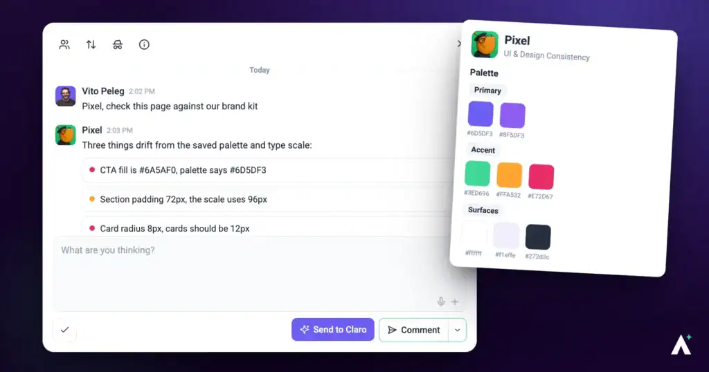
Pixel is the design eye on your team. Spacing that drifted, a heading that doesn't earn its size, a button that picked up the wrong purple somewhere along the way — the things a designer notices in two seconds and everyone else feels without being able to name. Pixel finds them, describes the fix precisely enough to act on, and can apply it to the page for you. He also builds — logos, images, sections, whole pages — so he is as much a designer you brief as a reviewer you run.
What Pixel can do for you
Pixel looks at how a page is put together visually and tells you exactly what to change. This is what you get back from him:
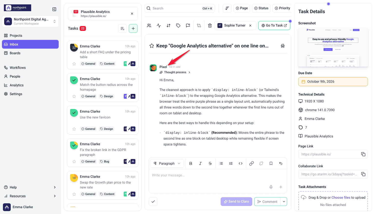
- Design findings in a page review. One task per problem, pinned to the element: a one-line summary, then Current (what is off now), Solution (the property and value to change, for example a mobile heading size of 36px to 40px) and Impact (why it matters), with a priority and the device it shows on. He covers layout, spacing, alignment, typography, color, component consistency and brand fit.
- Answers in a task. Select Send to Claro on a task about how something looks and Pixel replies in the thread with the fix.
- The change itself. Where a finding or a reply proposes a change, Show me previews it on the page and Do It applies it on a WordPress site connected through the Atarim plugin. On any other site, the task already says what to change, so it is ready to hand to whoever builds the site.
- New design work. Ask for a section, a page or a style guide and he builds it to your brand kit. See Design work, not just review.
Pixel Personality Snapshot
Pixel is UI & Design, and the closest thing the team has to a fussy senior designer looking over your shoulder. His own line when a check begins is Pixel reporting for detail duty, which is about right — the work is noticing the four pixels, the heading that’s a size too close to the one above it, the button that picked up a slightly different purple two redesigns ago.
What separates him from a generic design opinion is that he has taste he’ll defend and won’t impose. He commits to the direction a page is already going rather than steering it toward his own, and he treats the usual AI design defaults — system-font stacks, purple gradients on white, palettes where every colour carries equal weight — as tells to avoid rather than safe choices. A dominant colour with sharp accents beats an even spread, every time.
He also matches effort to the page, which is why he can seem underwhelming on good work. A refined page gets restraint and precision; a bold one can carry something more elaborate. Elegance, to him, is executing the existing vision well rather than adding more to it. And he’d rather tell you a brand value is missing than pick a colour that looks about right — a guess that looks deliberate is worse than an obvious gap.
How it actually works
Pixel works three ways, and the difference between them matters.
| Mode | What Pixel does | Does anything change? |
|---|---|---|
| Checking | Looks at the page and reports what’s off. | No. A check writes nothing, ever. |
| Changing | Applies a specific visual change you’ve asked for. | Yes — scoped to that element. Your own Do It applies straight away; a change you ask the AI to apply to a published, private or scheduled page waits for your approval. |
| Building | Makes something new — a logo, image, section, page or style guide. | Yes — staged as a draft and swapped in on your approval. |
What you can check
A review checks the page you have open.
| Target | When to use it |
|---|---|
| A single page | Before a handover, or when a specific page needs attention. |
| More of the site | Checking brand consistency, since styling usually drifts page by page, over months. Run a review on each page that matters, or ask Claro in workspace chat (Beta) to look across the site. |
What Pixel looks at
| What he checks | What that catches |
|---|---|
| Layout and spacing | Structure that’s gone loose, padding that drifted between sections, rhythm that stopped being consistent. |
| Alignment and balance | Elements a few pixels out, columns that don’t sit right, weight pooling on one side. |
| Typography hierarchy | Headings that don’t lead the eye, sizes too similar to establish an order, weight doing no work. |
| Colour harmony | Colours that fight, or a palette that drifted from the brand over time. |
| Consistency across sections | The same component styled three different ways on one page. |
| Component cohesion | Whether buttons, cards, forms and inputs feel like one family or like parts bought separately. |
| Brand alignment | Anything that’s stopped matching the brand kit. |
| Across screen sizes | Layouts that hold up on desktop and fall apart on a phone, and components that restyle badly at a breakpoint. |
The brand kit is the design system
This is the single biggest lever on the quality of what Pixel gives you. With a brand kit, he pulls your exact values — palette, fonts by role, button styles, corner radius, spacing — and works inside them. Without one, he’s working from the page alone, and the results are correspondingly generic.
If the brand values aren’t saved on the project, Pixel looks for a style guide or brand document among your files rather than giving up, and works from the exact values in it. He’ll tell you which source he used, and suggest saving those values onto the project so the next run finds them straight away.
What “good” means to Pixel
Design feedback is only useful if it’s held to a standard. Pixel’s is deliberately specific, and mostly about restraint.
| Principle | What it means in practice |
|---|---|
| Commit to the page’s direction | He matches the existing type, spacing rhythm and colour system rather than introducing a different style on top of yours. |
| No generic AI defaults | System-font stacks, purple-gradient-on-white, and flat evenly-spread palettes are treated as tells to avoid, not safe choices. |
| Dominant colour, sharp accents | A palette with a clear lead and deliberate accents beats an even spread of equally weighted colours. |
| Hierarchy through contrast | Typography earns its order through real differences in scale and weight, not through everything being roughly the same size. |
| Effort matched to the page | A refined page gets restraint and precision. A bold page can carry elaborate treatment. Elegance is executing the existing vision well, not adding more. |
How suggestions are written
Every suggestion names the element and the property, so it can actually be acted on — by Pixel, by you, or by a developer who wasn’t in the conversation.
Not: “Improve the spacing in the hero.”
But: “Increase the padding inside the hero section from 40px to 80px.”
Not: “Use a better colour for the button.”
But: “Change the primary button background to the brand purple.”
Running a check
Pixel reads the page as it renders, so what comes back is about how it looks rather than how it is built.
Instructions:
- Open the page from Projects, then open the Review tab in the sidebar.
- Choose the preset that matches your goal for the page — each one carries its own set of specialists — or switch to Custom to write your own prompt and pick the specialists yourself. Only Perfect my design brings Pixel in automatically. A preset fills in the description and replaces anything already typed there.
- On Let’s invite your InnerCircle, check that Pixel’s switch is on. The preset sets the switches, you can turn any specialist on or off, and Claro’s switch always stays on.
- Edit the description the preset filled in so it says what matters on this page. With Custom, write it yourself.
- Select Review This Page and leave it — it works down the page section by section in the background, judging each section at desktop, tablet and mobile. The findings are listed under Tasks in the Review tab, grouped by section of the page, each signed by the specialist who raised it.

What comes with each finding
Each finding arrives as its own task, grouped by section of the page and marked with the device it was spotted on, carrying the context someone would otherwise have to go and gather.
| Captured | Why it matters |
|---|---|
| Screenshot | Shows the page as it was when the finding was made. |
| Element location | Identifies the exact element, not the general area. |
| Screen size and browser | Explains problems that only appear on certain setups. |
| Status, priority and tags | Lets the finding move through your process like any other task. |
| The thread | Replies and decisions stay attached to the finding itself. |

The check closes with a summary of what was found, and a report you can send straight to your client.
Show me, then Do It
Pixel’s changes are built to be seen before they’re kept.
Instructions:
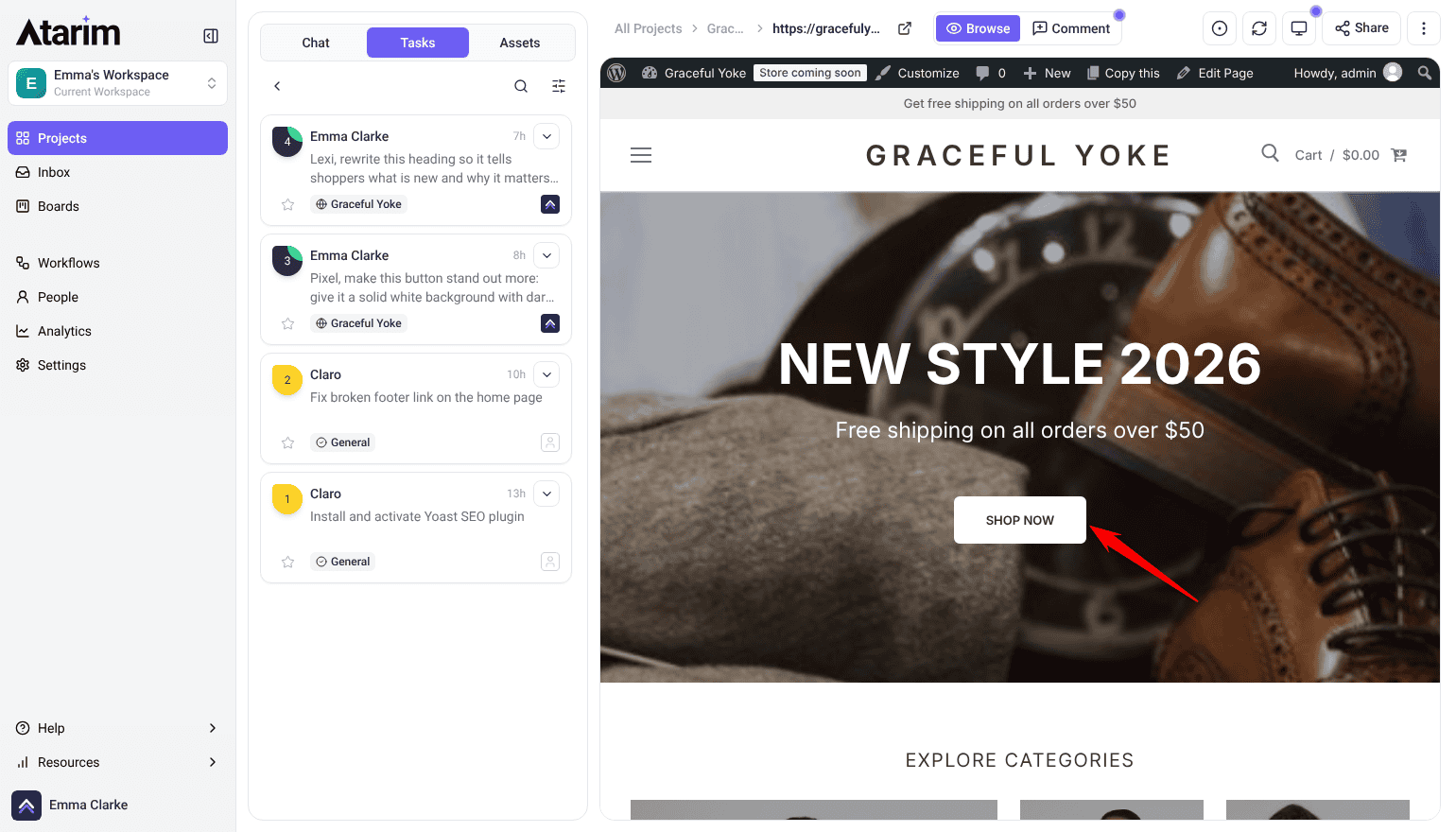
- In Collaborate, select Comment, select the element on the page, type your question and select Send to Claro. A finding from a review that proposes a change already has these buttons, so you can start at step 3.
- Pixel replies in the thread with what he’d change and why.
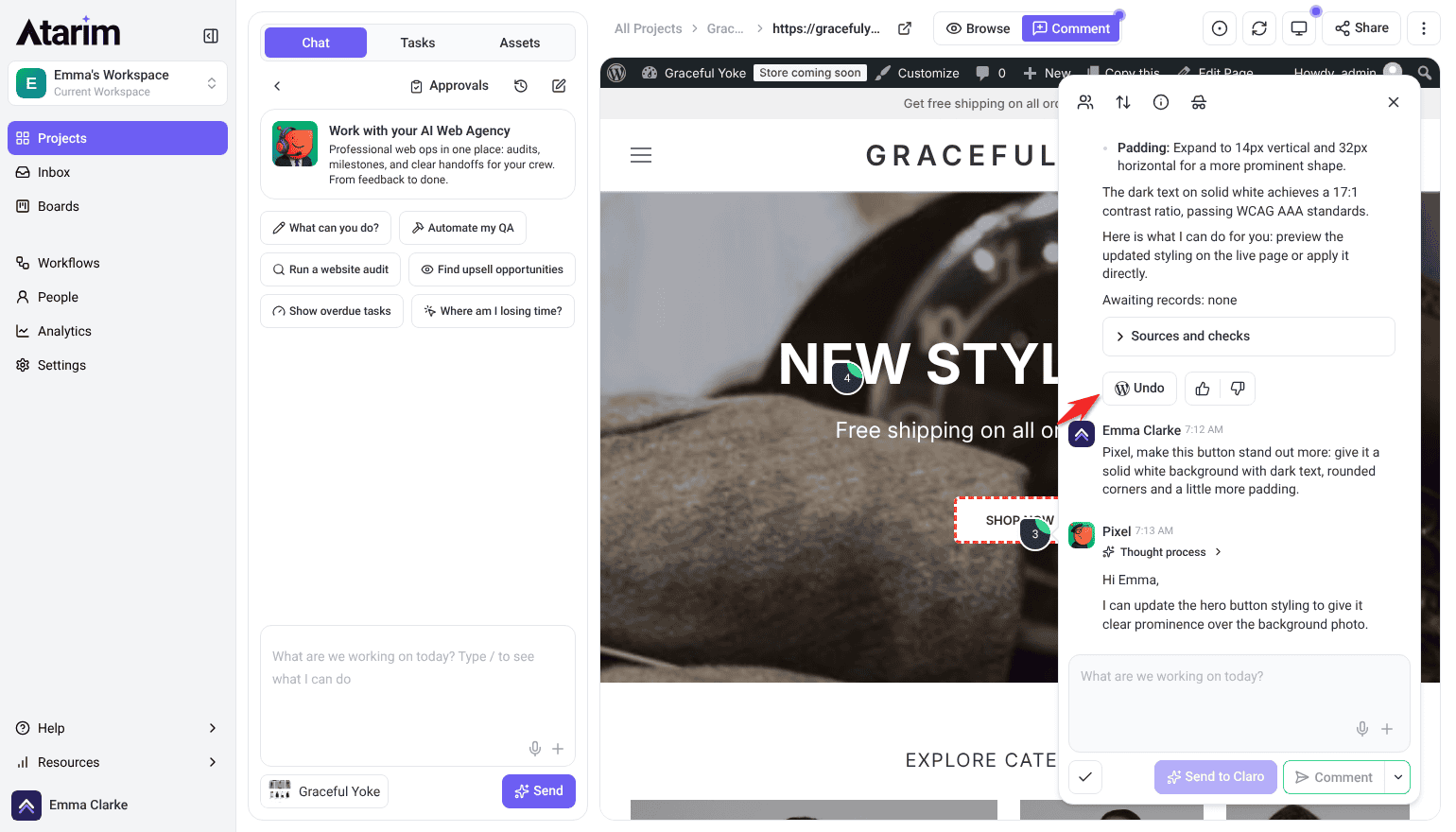
- Select Show me to apply it to the page in front of you. You see the actual result rather than imagining it from a description.
- Select Do It to apply it for real, or leave it and ask for something else. It queues and applies in the background, so you aren’t left waiting on it. Once it has applied, the task moves to Pending Review.

Design work, not just review
Reviewing a page is the half of Pixel most people meet. Design work is the other half: ask for any of the below and it routes to the design side of the team, held to the same brand and quality standard as everything else.
| Ask for | What you get |
|---|---|
| A logo | A proper logo brief rather than a single picture — the reasoning, four concepts, one recommendation, the lockups, and the mark shown under pressure and in real use. |
| An image | On-brand imagery for a hero, banner or product shot, art-directed to match the site’s existing visual set rather than looking like a generic one-off. |
| Icons or vector graphics | Hand-authored SVG — icons, dividers, decorative shapes, patterns, or a small icon set. |
| A section | A hero, testimonial band, feature explainer, pricing block, FAQ or call-to-action, built into an existing page so it looks like it was always there. |
| A page or landing page | A full page built to the brand, rather than assembled from stock blocks. |
| A redesign | The same content made better. He keeps what already works rather than starting over, so a dated page gets lifted, not replaced. |
| A style guide | Logo, colours, fonts, imagery direction, voice, buttons and spacing captured in one reference everyone can work from. |
| An email template | A branded, email-safe layout you can reuse — welcome, update, offer or notice. |
| Stock imagery | Photos sourced to fit the brand, with alt text and filenames sorted rather than left as IMG_4471.jpg. |
| A featured image | Built from a fixed template, so a run of posts stays visually consistent. |
Designs and mockups
Reviewing a comp before it’s built is the cheapest time to catch a spacing or hierarchy problem — a fault in a component becomes a fault on every page using it. Pixel can review a design, not only a built page.
The route is different, though, and that catches people out. A page you check from the canvas. A design you ask for in workspace chat (Beta) — tell Claro which design you want looked at and what you’re weighing up, and it sets the review going and brings the findings back to you.
Where Pixel works
Most people meet Pixel in a page check. He turns up in several more places, and behaves differently in each.
| Where | What he does | How it starts |
|---|---|---|
| Page checks | Inspects a live page and reports what’s off. Changes nothing. | Choose a preset, or pick him with Custom. |
| On the page | Answers about a specific element and applies the change there and then. | Click an element and ask. |
| In a task | Works inside a single task — designing, applying, and commenting the result. | Claro routes the work to him, or you ask in the task. |
| Workspace chat (Beta) | Picks up design work across all your projects and sites, with Claro coordinating. | Ask Claro; it routes design work to Pixel. |
| On a schedule | Recurring design work — a monthly brand-consistency sweep, a check after every theme update. | Set up a workflow. It creates the task and puts Pixel on it when it runs. |
| On a design | Reviews an uploaded design or a Figma frame before anything is built. | Ask Claro in workspace chat (Beta); there’s no canvas button for it yet. |
Working with a reply
Every AI answer carries a few controls beneath it. Alongside Show me and Do It you can copy the response, and mark it a good or bad response with the thumbs — that rating goes back to us and is how the specialists get better at the work you actually do.
The composer underneath has a Send to Claro button beside a Comment / Add a note split button. Comment posts normally. Send to Claro brings the AI in, and whichever specialist the work belongs to is the one who answers. Add a note posts internally — only Admins and Team Members can see it. To hide the whole task from guests and clients, select the internal icon at the top of the task (its tooltip reads Set internal task). Select it again to undo.
What Pixel doesn’t do
| He doesn’t | Who does |
|---|---|
| Check whether things work | Broken links, missing images and faulty forms are Glitch‘s. |
| Run accessibility audits | Contrast compliance, keyboard navigation and screen-reader structure are Navi‘s. |
| Rewrite copy properly | Wording, tone and persuasion are Lexi‘s. |
| Review SEO | Metadata, structure and search are Index‘s. |
| Guess at what he can’t see | He judges what’s visible on the page, and won’t speculate about states he hasn’t seen. |
How Pixel treats your site
| Rule | What it means in practice |
|---|---|
| Change one thing | Asked to fix a button colour, he changes the background value. He won’t restructure the button, its container, or the elements around it. |
| Preserve what he wasn’t asked about | Markup, classes and content outside the scope of the request are left exactly as they were. |
| Your live page stays up | He won’t unpublish it, rename it, change its address, or bin it to make room for a new version. |
| Redesigns happen on a draft | Exploring options or rebuilding happens on a draft or duplicate. It’s swapped in once, only when you approve it. |
| Approval before it lands | Anything needing your sign-off waits for you rather than applying itself. A request nobody decides on within 14 days is declined automatically, and nothing runs. |
Working with the other specialists
| Specialist | Handles |
|---|---|
| Glitch | Broken links, missing images, faulty forms. |
| Navi | Accessibility, contrast compliance, keyboard navigation. |
| Lexi | Wording, tone, calls to action. |
| Index | Page titles, descriptions, search structure, speed. |
| Claro | Turning vague feedback into clear work, and directing the rest. |
Frequently asked questions
Do I need a brand kit to use Pixel?
No, but it changes the results substantially. With one he works from your exact palette, fonts and styles. Without one he’s working from the page alone, and suggestions are more generic.
Will he redesign my page in his own style?
No. He deliberately commits to the direction the page already has, matching its type, spacing and colour system rather than introducing a different look. If you want a new direction, ask for one.
Will he change my site while checking it?
No. Checking never changes anything. Applying a change is separate, and anything needing sign-off waits for your approval.
What’s the difference between Show me and Do It?
Show me applies the change to the page in front of you so you can see it. Do It keeps it. On a connected WordPress site, keeping it writes the change properly.
Why didn’t my change save?
Do It saves a change only on a WordPress site connected through the Atarim plugin. Show me is a preview rather than a save, so its change disappears when you refresh.
Will he make up a colour if my brand kit is incomplete?
No. Where a value isn’t defined he says the work is partial and names what’s missing, rather than choosing something that looks about right.
Will he write placeholder statistics or testimonials?
No. Rather than filling a layout with invented figures, he designs around the gap — a shorter section or fewer blocks — and tells you what’s missing.
Why is his suggestion so specific about pixel values?
So it can be acted on. “Improve the spacing” isn’t something anyone can apply in one click; “increase the hero padding from 40px to 80px” is.
Can I undo a change later?
Yes, while the saved original still exists — a copy is kept before the change is applied. Each change affects one element, so there’s a single thing to put back.
Can Pixel design a logo?
Yes. You get a logo brief rather than a single image — the reasoning, four concepts, a recommendation, the lockups, and the mark shown in real use.
Can he build a whole page, not just fix one?
Yes. Sections, full pages, landing pages and redesigns. A redesign keeps the existing content and makes it better rather than starting from scratch.
Will a redesign take my current page down?
No. It’s staged as a draft, checked, and swapped in once when you approve it. Your published page stays live throughout.
Can I check more than one page?
A review checks the page you have open. To cover more of a site, run a review on each page that matters, or ask Claro in workspace chat (Beta) to look across the site. Comparing several pages is the quickest way to find where brand consistency has drifted. A design that hasn’t been built yet can be reviewed too, by asking Claro in workspace chat.
Does he check accessibility?
No. He handles whether colours work together and suit the brand. Whether text is legible enough to pass accessibility standards is Navi’s job.
How do I turn a finding into actual work?
Use Show me to preview the change on the page, then Do It to apply it. It queues and runs in the background, and an Undo control appears on that comment afterwards if you change your mind.
Which findings should I fix first?
Work in priority order. Critical (red) and high (orange) affect conversions and clarity, so start there; medium (yellow) covers usability and hierarchy; and low (green) is cosmetic.
Can I use him on a site that isn’t WordPress?
Yes, for advice and previews on any page. Saving changes needs the Atarim WordPress plugin on WordPress 6.9 or later.
Common issues
- Suggestions feel generic — there's probably no brand kit on the project. Set one up and run the check again.
- He says the work is partial — a brand value he needed isn't defined anywhere. He's named what's missing rather than inventing it. Fill that in and re-run.
- A change vanished when you refreshed — that was a Show me preview, which is never saved. Use Do It on a WordPress site connected through the plugin to keep a change.
- Very few findings on a page you think needs work — he commits to the page's existing direction rather than proposing a different style. If you want a different direction, ask for one explicitly.
- He didn't flag a contrast problem — accessibility contrast is Navi's. Include Navi in the check.
- A section has empty space where stats should be — he won't invent figures to fill a layout. Supply the real content and ask him to lay it in.
- Undo isn't available on a change — the saved original is no longer there. Restore from a backup instead.
Conclusion
Pixel gives you a second set of design eyes that never gets used to a page. He names the element and the property rather than gesturing at a feeling, holds the work to your brand rather than a generic default, and applies the change on the page so you can see it before you keep it. And when what you need doesn't exist yet — a logo, a section, a style guide — he builds it to the same standard.
The single thing that most affects what you get out of him is the brand kit. With one, he's working inside your design system. Without one, he's guessing at it politely. Explore Agency Brief: Building Your Brand Kit.
Tips & best practices
- Set up the brand kit before anything else — it's the biggest lever on quality.
- Use Show me in front of clients rather than describing a change.
- Connect the plugin before a working session, so changes save instead of vanishing.
- Pair him with Lexi on client-facing pages; look and wording usually fail together.
- Include Navi when accessibility compliance matters — Pixel doesn't cover it.
- Ask explicitly if you want a new direction; by default he works within the existing one.
- Supply real content rather than expecting him to fill gaps convincingly.
- Save brand values onto the project when he tells you he found them elsewhere.
- Undo promptly if a change is wrong — it relies on the saved original being there.
- On an inherited site, review its key pages to find where the brand drifted.
- Ask him to build, not just review — logos, sections and style guides are all in scope.
- Re-run a check after a round of manual changes to see what's left.